You’ve seen it.
A shiny sign with the wheelchair (accessibility) symbol, proudly displayed on a parking spot.
But here’s the catch:
That spot is very far from the entrance. No ramp. No path. No chance.
What accessible parking should be
Real inclusion starts the moment someone arrives.
An accessible parking space should:
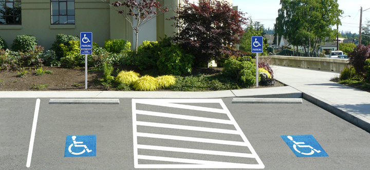
- Be as close as possible to the main entrance.
- Be wide enough for safe unloading — especially from a wheelchair van
- Be connected to a safe kerb ramp or accessible pathway
- Be clearly marked, well lit and easy to spot
It’s not just for wheelchair users.
Think of:
- A mother with a stroller trying to navigate steps
- An elderly person with limited mobility
- Someone recovering from surgery, walking with crutches
Designing for accessibility helps everyone, not just a few.
What actually happens
Here’s how it plays out in real life:
- The parking spot is on the far side of the building
- The nearest entrance has stairs — no ramp, no lift
- There’s no safe drop-off zone for vans or taxis
- The “accessible” label is there… but the access isn’t
It doesn’t feel intentional. But it excludes, every day.
Small Changes, Big Impact
- Moving a space 20 meters closer.
- Adding a kerb ramp.
- Ensuring a clear, safe path.
That’s the difference between inclusion and quiet rejection.
And here’s the business case:
A well-placed, truly accessible parking spot doesn’t just serve persons with disabilities, it helps parents with toddlers, elderly shoppers, delivery teams and more.
When people can access your space easily, they’re more likely to visit, stay and spend.
Accessibility isn’t a cost — it’s an investment in usability, in customer satisfaction and in growth.
You can help us keep telling these stories
If you believe this kind of work matters, support us to keep going:
Does 💜🔗 Support IncluSphere
Let’s keep breaking barriers, one post, one parking space, one bold change at a time.
The entrance should welcome everyone not just the lucky few.

Leave a comment